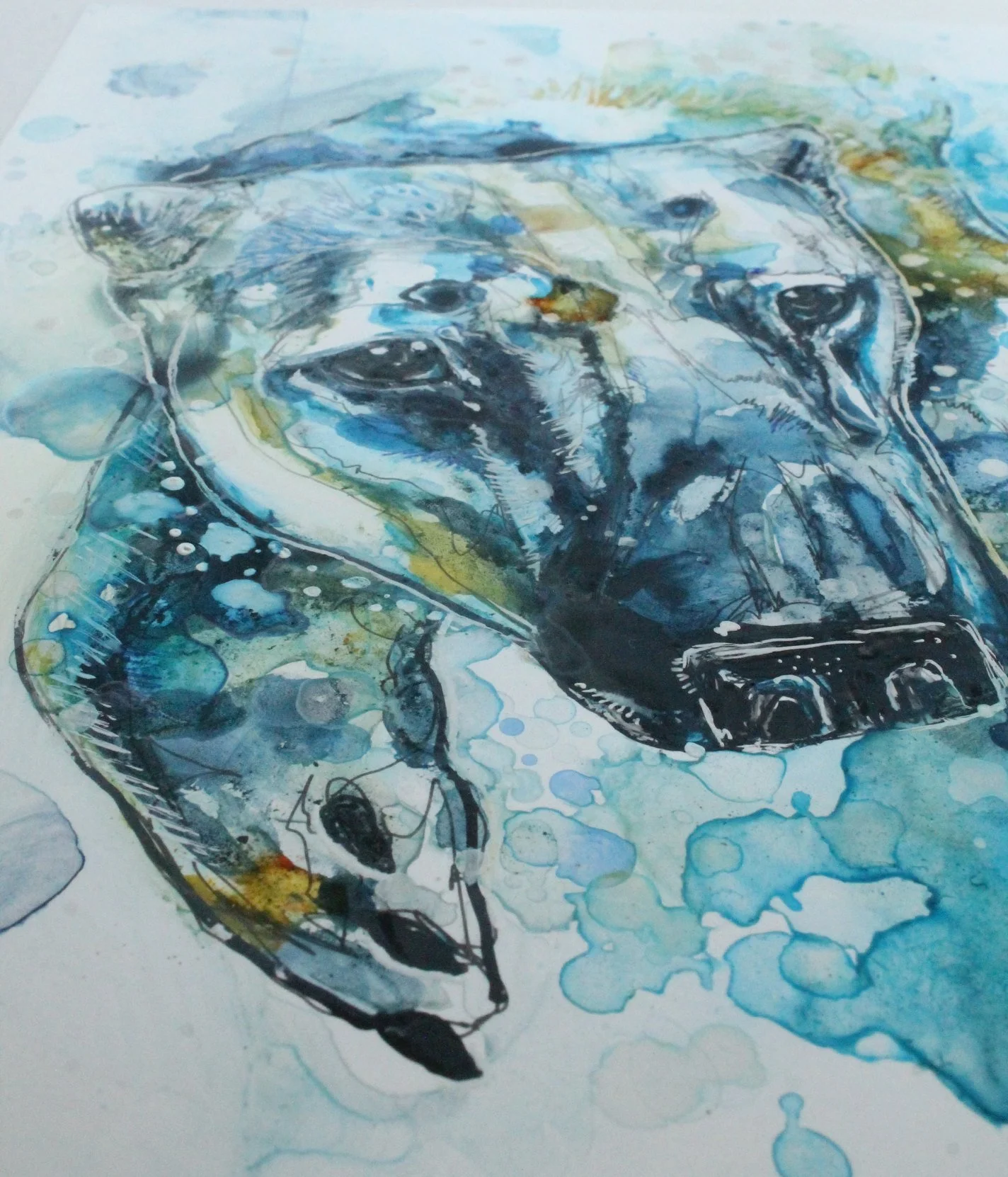
I’ve started open water swimming, inspired by my Nemo by Sea blog. When I started dipping my toe into the North Sea in late May, I was having a real problem with cold shock in the 12 °C water. Anyway, I found this polar bears picture on my computer and set about painting him on some scrap I had lying around.
I wonder if they even feel the chill leaping into that ice cold water of the Arctic? The water in the North Sea has risen 2 °C since I started swimming, but the water still takes your breath away every time.

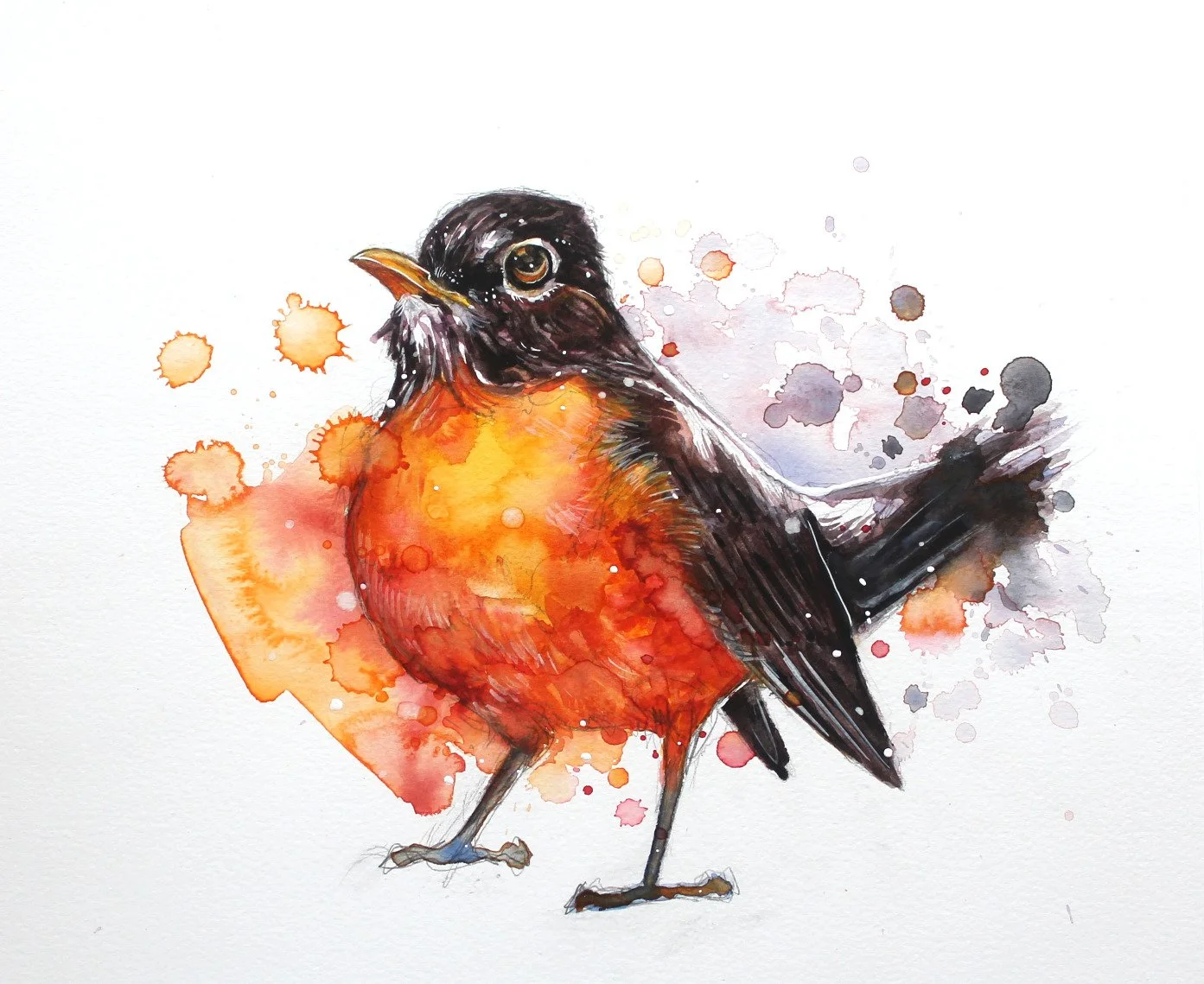
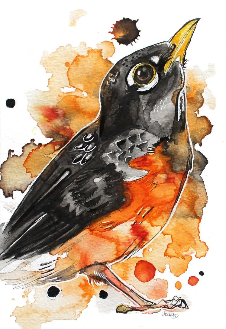
A Bird Without Lines

This is a first for me, painting like an actual watercolourist, no hard black lines, no fineliner, just a pencil and watercolour paints.
Initially I was following an online watercolour course which went laughably and terribly wrong …
But that little mouse I painted before the tutorial gave me hope I could paint the bird better myself.
Using the reference image provided which happened to be an American robin (not that you could recognise from my first attempt), I feel like I have stumbled upon something much different. I guess online tutorials aren’t for everyone!
Oil and Block Printing Inks on Yupo
I have a bit of a war on my hands with Yupo, although I love its smooth texture and the way it makes paint swim and dance on its surface, I’m always trying to mess with it. Make it do things it doesn’t want.
I have this crazy idea that I can make Yupo perform similarly to a drypoint plate, except without the printing. I love the idea of carving out an image instead of building one up.
I find with watercolour I sometimes get bored with what I’m doing as I use too much water, making it take longer to dry and most efforts just go in the bin. On reflection, I may be a little abusive with all art materials …


I thought I’m going to give oil on Yupo another go to achieve a drypoint effect and contrast it against my watercolour on Yupo version.
As you can see I didn’t get too far with this. Although I initially loved applying thick, black layers of oil, scratching into it, and smearing it around, the heavier spots aren’t even dry and it’s been weeks. Applying watercolour or alcohol inks at this stage would be a disaster.
I also found that pulling and manipulating the oil around made my reference drawing disappear underneath as it was rubbed out of existence, which I did not like. It was also really messy, slippery and hard going, taking in the fumes from the turpentine all the while.
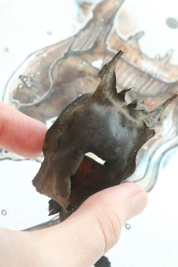
It’s a shame as I was liking the carved out polar bear head but the image was too much of an uphill struggle to really get rolling with it. One other thing I noticed, the coloured oil paints started to separate and go ‘gloopy’, which looked pretty awful.


Another experiment I tried was with water-based block printing inks. Contrasting this time with a regular watercolour on paper image. The aim with the Yupo this time was more of a mixed media experiment, I wanted to create that drypoint style whilst incorporating other materials I often use.
I firstly used alcohol inks to create more interest in the background (which I stripped as I found out that washing up liquid and alcohol inks don’t make for good bedfellows, oops).
I then applied the black, block printing inks to the image which started out as quite abstract but rather foolishly, I fell into old ways and boom a full rabbit head appeared. It’s easy to get carried away in art. After the block printing ink was dry I went in with watercolour, Brusho and ink to finish it off.
I’m not pleased with the image itself, but I am pleased that I could carve and manipulate the block printing ink with absolute control, without the stink and without waiting weeks for it to dry, easily thinning or removing the ink with water or washing up liquid for tougher areas.

Forgotten Finds of 2021
Where does the time go? Nemo and I have been over the rocks a lot last year, here’s some of our finds from 2021. We’ve quite the collection of British beach finds now, and we’re still going strong into 2022!
You can see more over at NemobySea.com
Robin Arrival


I was looking out into the garden and along the fence, to my shock, was a robin with the steeliest eyes.
I don’t see many small birds around much with neighbours cutting away hedges and shrubs in favour of American dream style lawns.
This robin reminded me how little birds have to themselves. It made me very sad, and naturally, I made some small paintings. I really like these paintings and i don’t think the flat glare of the computer screen do them much justice. These A5 paintings feature crêpe paper, watercolour pencils and Brusho, and I’ve put them up in my shop in case someone likes them as much as I do.


Harbour Seals
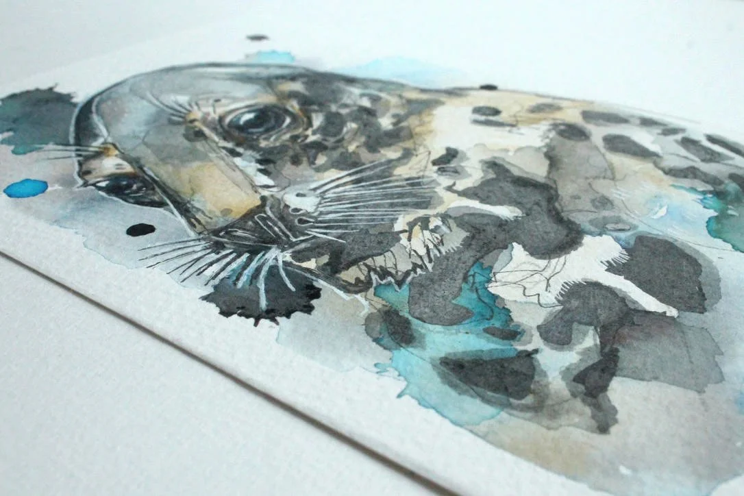
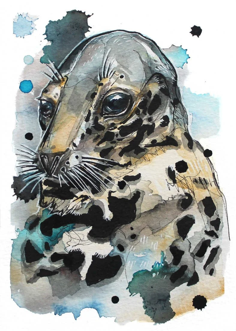
One of my favourite paintings are of grey seals, so I decided to try painting some fun images of harbour seals on A5 paper which are locals to the South East coast of England. I saw a massive harbour seal wash up on Viking Bay in Broadstairs and was completely shocked on how big these guys can grow.
Froggy Visitor

Over the summer we had another little visitor, one which thankfully didn’t need any intervention. Nemo begrudgingly donated his water bowl to this juicy frog found in our garden. I think I will paint him again much darker and tighter, I filled up the space on the paper with as much frog as possible.
I also was recommended a frog to paint by one of my dear commissioners, the bird poop frog! A tree frog like the name suggests disguises itself by imitating poop on a leaf. I would like to also paint a few more versions, frogs are gorgeous. The common frog and bird poop frog here are available in my shop.


Dunnock


This poor little dunnock, (also known as the hedge sparrow) booked herself in for an 11 day stay over the summer. We found her close to the promenade and didn’t want her plopping into the frigid North Sea so we took her home to release at a later point.
We bought her a cage and fed her meaty dog food every few hours until she was strong enough to fly and forage. As you can see, little fledglings grow fast and become completely wild with each day — a really good sign that she’ll be just fine.
We would have loved a wildlife rescue to raise her to full strength, but most rescue centres have closed down, so we tried to do the best we could for this brave, little dunnock.
I painted her adult form in watercolours, crêpe paper, pastel, Brusho and ink.

Blue Hare Work in Progress

I’m working on this blue hare for an exhibition entry, I have my other three also painted with Brusho and watercolours but I think I needed a blue one. I’ve gotten so far and feel like it’s ready for recycling, the fate of many of the paintings I make. At least it is posted here, where it can live forever.
I think I’ll have a go with powdered charcoal and Brusho instead, I’m sure that will be more interesting.
Grey Squirrel

With the lovely big blue eye which you never get in reality, here we are with another grey squirrel. This is another painting I managed to draw straight onto the paper with complete confidence. I love the bloom on his right facing ear. These things happen when you leave your paint alone and allow watercolour magic to happen without human meddling.

Bird Trio Commission

These lucky birdies have a new home in Ohio. The trio features the red (northern) cardinal which is the the state bird of Ohio, the barn swallow and the American robin.
These were small A5, cold pressed watercolours painted mainly in Brusho and watercolour.
For fun I thought I would include a tragic photo of all the drafts to embarrass myself, why not?
Most of the time I just lose that ‘special feeling’ about artwork I make and just ditch it and make another one. I like to think I keep those kind people at *Canson and *St Cuthberts Mill in Rolex, haha!
*Not sponsored by the way, but highly recommended. They deserve their Rolexes anyway.
Rainbow Wolf

I’ve been working on a few paintings of wolves for a friend’s book trilogy, this one she’s really taken with, but it’s a little too simple for me to be entirely happy with. I used watercolour pencils for the fur texture instead of watercolour and used a watercolour block instead of a sheet which means this puppy dried really flat.
It’s taken a while, but not needing the lightbox crutch to transfer images and having the confidence to draw straight onto a surface is a huge deal for me. The constant buckling of watercolour paper pushed me into it!

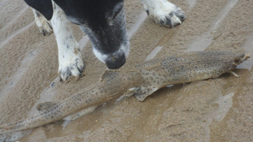
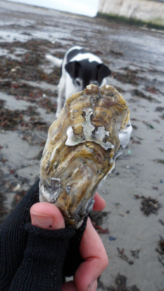
Spring Epple Bay Finds 2021
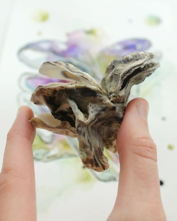
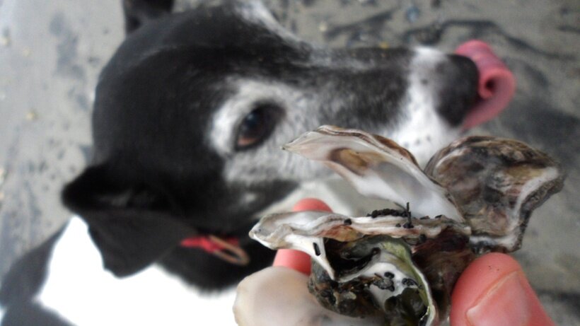
Here’s a few teasers of the things I found in Epple Bay over the spring. For more art inspired by coastal bits and pieces check out my Nemo by Sea blog. Nemo is 13 years old this year, and still really loves the local bays and cracking open as many blue mussels as he can find and gobbling the slime, a true sea-foody.
Project Re-Think-Re-Wild

I was involved with an ambitious ecology project funded by the British Ecological Society to produce artwork to be animated to raise awareness about having specific controversial fauna and flora introduced back into Europe. Here is some finished and unfinished art I created for the project, along with the draft animation.


Re-Think-Re-Wild ran out of funding unfortunately, but it was a great experience which was made possible by brilliant ecologist Rob Lewis, Jens Christian Svenning, Ashley Pearcy with talented animator Denis Chapon and The Animation Workshop VIA.
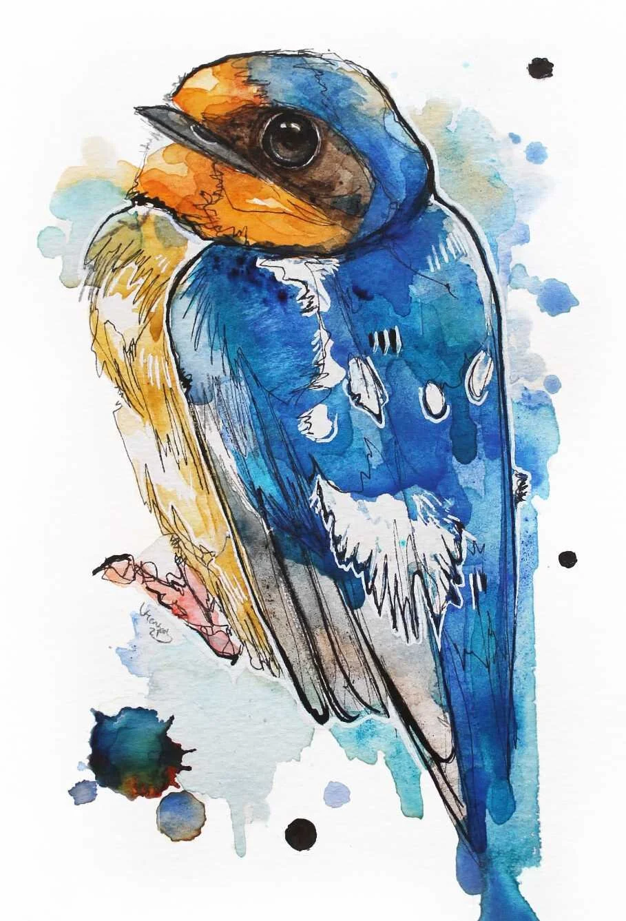
Barn Swallow and American Robin
I’ve been working on a set of paintings for a trio commission featuring the red cardinal, barn swallow and American robin. I haven’t cracked the red cardinal just yet but a couple of these guys have been chosen to go on a wall overseas, which I’m so happy I could decorate!


Red Cardinal
I’ve had many attempts at the Red Cardinal during my arty practice. So many awful paintings that I couldn’t even put them on here, which is pretty sad actually as it would have been a wonderful contrast.
I’m not sure why this bird has given me so much trouble in the past. I think like always, I just went in too hard with colour and found there was no where for me to go with it.But by the power of watercolour, ink, crêpe paper and a huge dollop of luck, I’m happy with this one, at last.
Although I painted this little guy for a commission, a different red cardinal was chosen, so this one is in my shop.

Barn Swallow Practice Painting

This was a draft of a Barn Swallow I was working on, I think it came out pretty well! I really scribbled out the initial image hard in graphite pencil before going in with fineliner and Indian ink. I really love the scratchy, frenzied quality, even though I was surprisingly pretty chilled out whilst creating the painting.
I used Brusho for that instant pop of deep dramatic colour.
Beaver Drawing

I saw this image of a beaver, and I just wanted to draw his head on copier paper, nothing special. Drawn with a 4B and HB pencil.

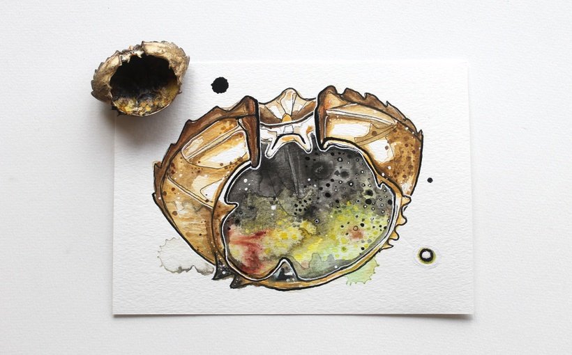
February 2021 Bay Finds
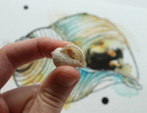
I have painted a few of Epple bay’s treasures this month on my Nemo by Sea blog. I got around to painting this tiny little whelk shell, which I blew up onto A5 and used it as my NbS icon. I’m pretty happy with the simplicity — a weird feeling!
Marbled Newts

These green little guys are marbled newts, found in France and northern Spain. But one of these lucky guys is off to Ohio to join his other brethren.
A challenging two-tone animal, green on black or black on green? I made a few practice paintings to see what looked best.
Against all watercolour rules (as you’re supposed to paint light to dark), I went with black first, green on top.
Painting is not a science for me just yet, it’s still a bit of a mystery. Making little drafty paintings before hand is helping me not make so many mistakes.

